How We Reduced Onboarding Drop-off by 30% in Complex SaaS & Fintech Apps
8/2/2026
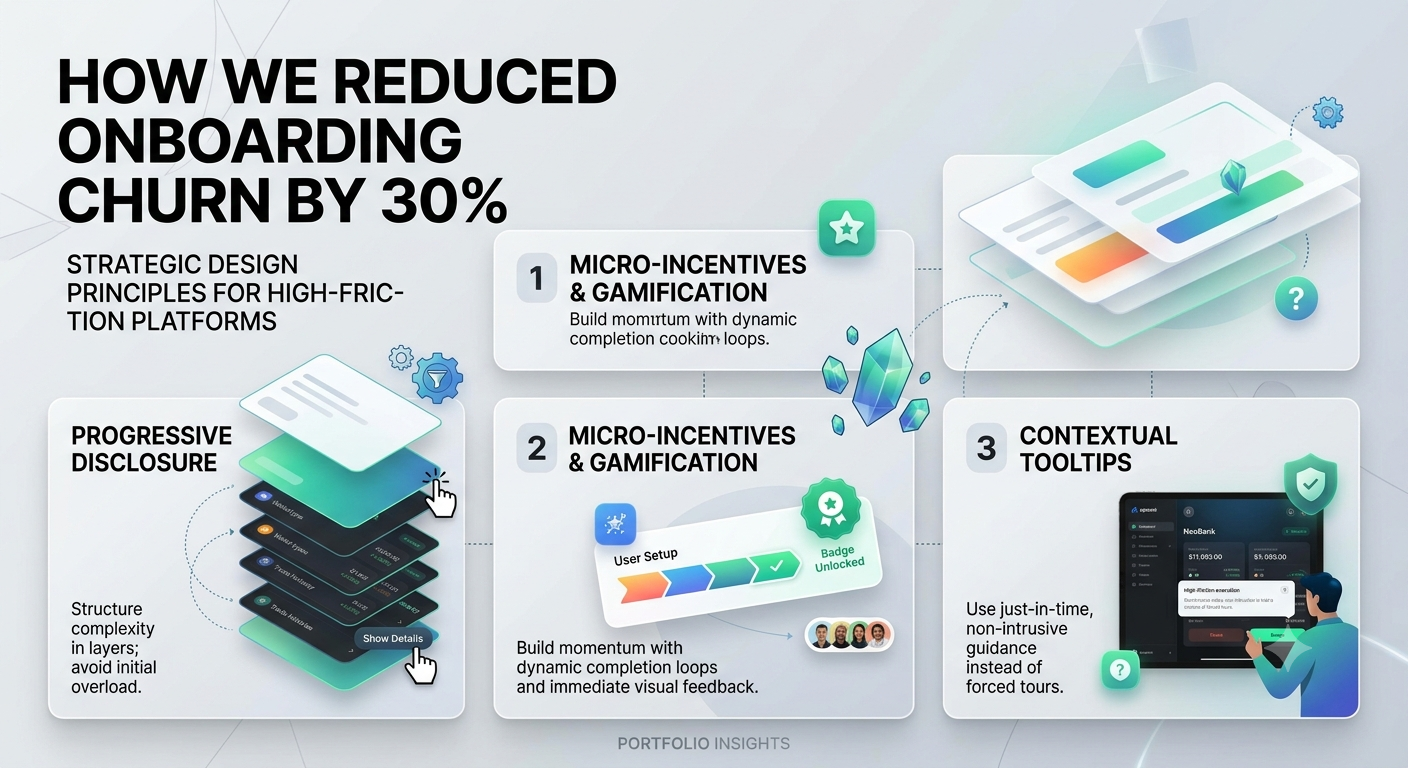
Designing interfaces for data-dense platforms—whether it’s a hybrid crypto/fiat banking app or an enterprise AI dashboard—presents a classic product paradox: How do you maintain deep functionality while keeping the user experience frictionless?
When users feel overwhelmed during their first session, churn rates spike. Based on our experience across recent B2B and consumer projects, we’ve pinpointed three core principles that bridge the gap between complex backend architecture and clean frontend UX:
1. Progressive Disclosure over Information Overload
Instead of presenting all features, wallet options, or data metrics at once, structure the user journey in layers.
- Primary View: Keep action-oriented metrics immediately visible (e.g., total balance or primary workflow task).
- Secondary View: Move granular settings, raw logs, or advanced token staking configurations into contextual sidebars or dynamic modals.
2. Micro-Incentives & Gamified Progress
Users complete setups when they feel a sense of momentum. By replacing traditional, multi-page onboarding forms with interactive 3-step dynamic quizzes and visual completion bars, we’ve seen onboarding completion rates rise by up to 35%. Giving users immediate visual feedback (e.g., green status badges, subtle micro-animations) reassures them that their input was successful.
3. Contextual Tooltips Instead of Forced Tutorials
Long product tours that force users to click through ten tooltips before using the app rarely work—most users skip them immediately. Instead, employ just-in-time guidance: display non-intrusive hints only when a user interacts with a specific high-friction component for the first time.
Takeaway: Great UI/UX design isn't about removing features; it's about managing user focus. By prioritizing visual hierarchy and progressive disclosure, you turn potential churn into immediate engagement.